Travel Guard
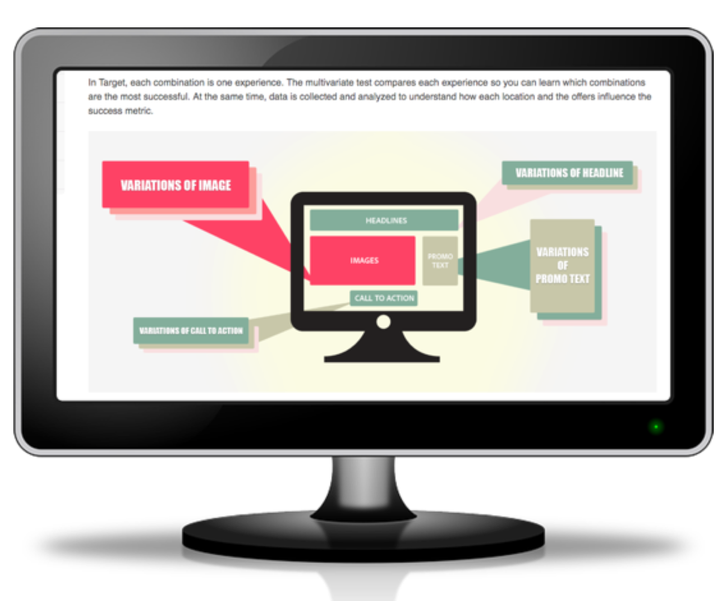
A “new” discipline brings user needs to the forefront in a battle against the multivariate-testing bots.
SNAPSHOT
Winter 2016: about 4 months
Business Partner: TravelGuard
Product: Travel Guard’s website, including purchase path.
My Role: UX Research and Design
Outcome: Compared to the experience optimized solely by multivariate testing, the new user-centered experience resulted in a 9% decreased bounce-rate, 25% increased overall conversions, and 180% increased mobile conversions. All travelguard.com traffic used the experience 2016-2024.
THE OPPORTUNITY
Travel Guard planned to migrate their legacy site, including purchase path, to Adobe Experience Manager (AEM), and was excited to utilize AEM’s multivariate testing tool Target to optimize the site and ultimately drive conversions.
AIG’s CTO of Data Innovation and Advanced Technology recognized the opportunity to inject user centered design into this update, and turned to the newly-formed Experience Design team for guidance. He scheduled a hackathon during which we would build a proof-of-concept for the Travel Guard business to evaluate.
THE LEGACY SITE
To prepare for the hackathon, we analyzed the legacy site, looked at competitive and comparative products, and spoke with travelers with a history of purchasing travel insurance.
The legacy site had a dated look and feel, had grown to include a lot of content meant to drive SEO, but that ultimately led users away from the purchase path, and captured data using a form that reflected its insurance-roots.
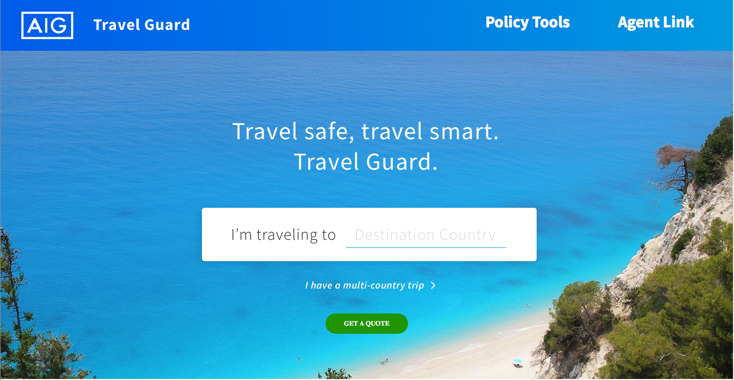
We were inspired and influenced by Virgin America’s purchase path (a much more modern and conversational approach to gathering user data compared to Travel Guard’s existing quote form), by AirBnB’s calendar, and by Berkshire Hathaway Travel’s colorful imagery.
TALKING TO USERS
To best meet user needs with the redesign, we needed to understand what motivates travelers to shop for travel insurance, something our desk research was unable to uncover. We quickly completed six user interviews with travelers who had a history of purchasing insurance coverage for some previous trips, and spoke to them about their travel habits and what drove them to seek insurance coverage for some trips.
A couple of trends emerged:
Travelers were motivated to seek out travel insurance when they had specific trip-related concerns, and these were usually limited to 1-2 main types of concerns per trip. None of the travelers we spoke to indicated that they sought the most comprehensive coverage, rather they sought to easily find a product that provided the type of coverage they needed (ex: trip cancellation or coverage for lost luggage) and learn details about the type of coverage they were looking for. Design implication: site organization should mirror this coverage-seeking behavior vs the legacy site’s very product-forward approach.
Even when asked specifically about travel insurance, travelers started by telling their travel story, almost always starting with destination. Design implication: gathering the data required for a quote should be accomplished in a way that allows users to tell their story instead of feeling like an insurance form.
A PERSONA AND JOURNEY MAP TO BUILD CONSENSUS
We created a persona and journey map to discuss with our business partners at the start of the 30-hour design hackathon.
Bringing our interviews to life with Shannon Reid, and giving her two trips, each different trip-related concerns, helped our business partners start to understand the difference between meeting people’s needs and meeting the needs of individual travelers, even if those needs change depending on their travel plans.
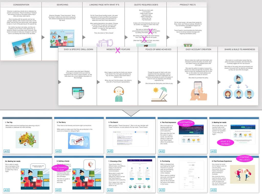
We created a journey map for Shannon that started before she entered the site and continued the experience post-purchase with an optional account-creation, a suggested new feature. We also suggested other possible features, such as product recommendations.
But, the hackathon needed to produce a proof of concept rooted in the realities of the existing requirements and constraints, so it was important to start having conversations around the current requirements and how they could affect the journey. For example, in the fourth panel of the journey map below, Shannon must leave the purchase path because she needs birth dates for all travelers she is purchasing coverage for. The journey map helped our business partners understand the real-word implications of data requirements they typically reviewed using spreadsheets, and this served as the first of many conversations around reducing the friction in the quote and bind process.
30 HOURS TO PROOF-OF-CONCEPT
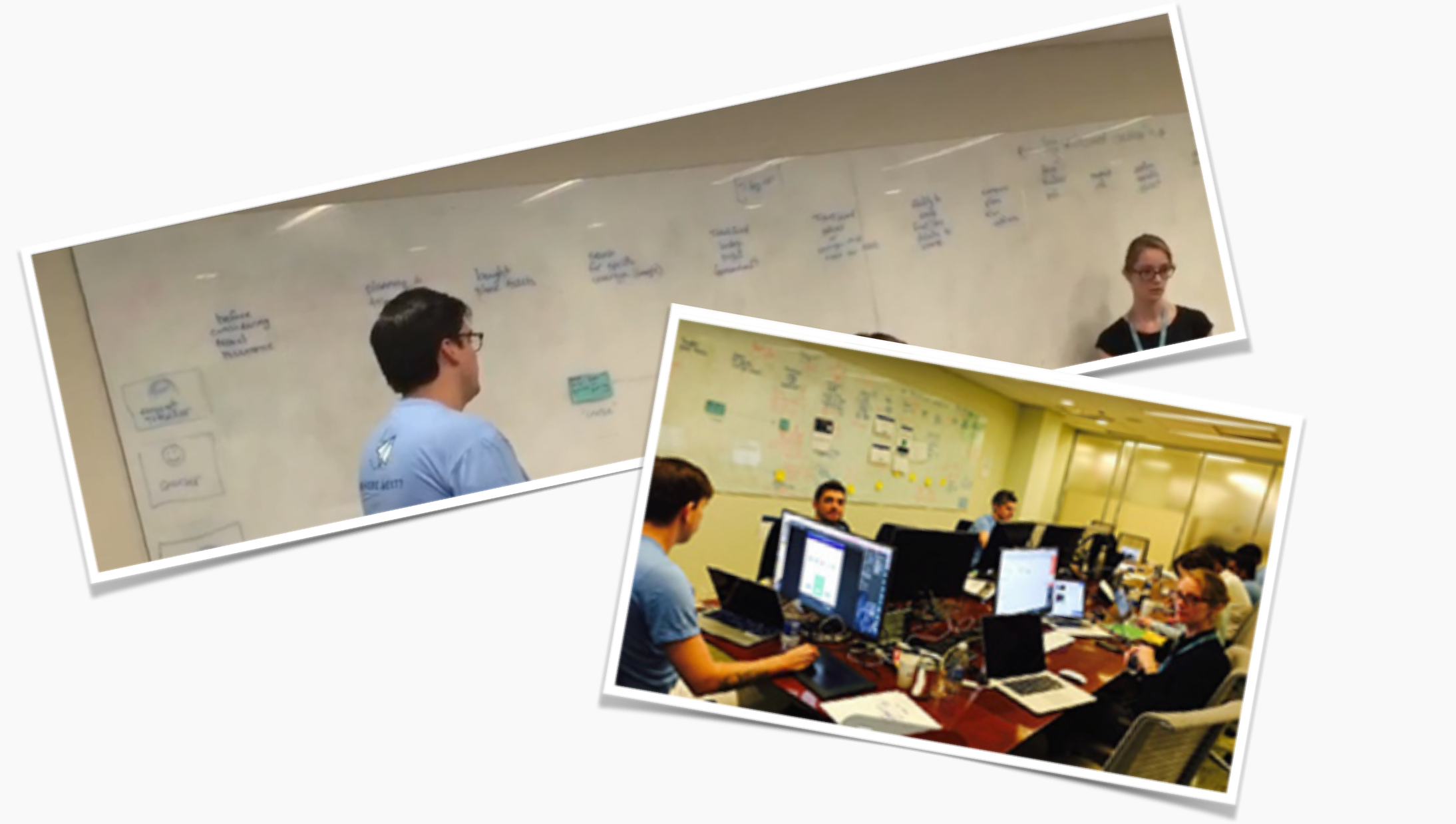
The hacakthon itself was very visceral. After we mapped the high-level journey across three walls, the designers worked to incorporate additional details into each step, creating wires of key screens, and finally increasing the fidelity to create a clickable prototype. At regular intervals, we printed updates, tacking them up to the appropriate place in the journey.
Our business partners came by throughout the day and evening to walk through the journey, providing insights and details that helped ensure that the innovative solution met business needs, accounted for the present-day requirements, and could be implemented with the current technology and data constraints.
A REFINED VISION
At the end of 30-hours, we had created a prototype illustrating key screens and a Vision deck that illustrated the proof-of-concept, showing just how innovative we could be in a short amount of time while meeting current requirements and constraints. Some of our initial suggestions were removed with a nod towards short-term feasibility, while other features were added, also with an appreciation for the possible.
The pre-hackathon journey on top was refined into a vision deck (bottom). Visual design by Josh Leavitt.
FROM PROOF-OF-CONCEPT TO USER-CENTERED PRODUCT
Informed by the user interviews, the new approach was to be more behavior-centric, focused around helping users find the coverage details they needed. But while the interviews had been informative in learning about motivations around purchasing travel insurance, they were not comprehensive enough to guide HOW users would categorize Travel Guard’s many types of coverage. To learn more, I conducted a remote card-sort that also included a prioritization task and used the UserZoom platform to host the test.
I included a prioritization question in the card-sort test and used the results when creating the wireframe for the Product Comparison Table (middle). The comp (created by Josh Leavitt, right) includes additional line-items that our business partners believed were important here.
A PROTOTYPE TO TEST AND SHARE
I quickly created a prototype that served three purposes:
Illustrate concept of a single-page scrolling purchase path to our off-shore development team
Facilitate collaboration with the visual designer, as since we were a new team, we did not have a pattern library and all components needed to be created from scratch.
Early in-office usability testing, which identified some components and interactions that needed iteration before we solidified the design and began development.
ORGANIZATION OF THE USER-CENTRIC MVP EXPERIENCE
I created a site map to communicate the IA of the new site, highlighting the multiple pages that included CTA’s to the purchase path. As the user-centered mvp site was, initially, to be accessed via paid-traffic sources only, our business partners easily agreed that it was not necessary to include a lot of legacy content intended for SEO optimization in this mvp experience.
TESTING THE NEW DESIGN
As I approached completion of the wireframes, I began to plan, author, and coordinate usability tests. The two main areas of focus were the new IA (would users be able to find the information they needed on the new site), and the usability of the purchase path itself (could users easily enter their trip information and make any edits required using the single-page scrolling experience).
I worked closely with the visual designer, our development team, and UserZoom in setting-up the tests, and when I learned that some additional JS code would facilitate analysis of the purchase path usability tests, I re-arranged the testing schedule to test the IA using static comps before the coded, purchase path test, to give our development team time to add the code without delaying the overall testing timeline.
Some examples of the usability findings and iterations made.
RESULTS
Once live, Travel Guard sent a percentage of paid-traffic to the new site, while also sending most users to the multivariate-testing optimized legacy site, in order to compare the two.
The new experience resulted in:
9% decreased bounce rate
25% increase in overall conversions
180% increase in mobile conversions
Soon, all traffic was sent to the new experience.
The success of the site was celebrated not only by the Travel Guard business unit but was seen as an important step in the adoption of Agile and cross-functional collaboration throughout AIG’s Digital organization.


